Relesys, improving the platform that powers 100+ client apps.
Year
:
2024
Company
:
Relesys
Project
:
App Configuration Platform
Team
:
3 designers, 1 Developer
The Relesys portal is the internal tool our design team uses every day to build, customize, and deliver multiple client apps. Over time, the platform had become outdated and harder to work with, tasks that should take seconds took too many steps, and workarounds had become a normal part of the workflow. This case focuses on the area of the portal designers use during implementation, and more specifically on two areas, the landing pages editor and the style editor.
This was part of a broader initiative to improve the platform, simplify the workflows, and make everyday tasks faster and more intuitive.
Scope of Work
User Flows
Wireframing
Interaction Design
UI Design
Product Thinking
Impact
Reduced friction in everyday workflows
Faster page management
Eliminated reliance on external tools
Fewer steps for common tasks
Challenge
A tool designers used every day had quietly become a frustration.
The portal had grown outdated and was slowing designers down. Simple tasks took too many steps, key actions were hard to find, and nobody had time to keep going back and forth just to get basic things done.
Approach
Focus on what matters most, not everything at once.
Not everything could be improved at once, time and development hours were limited. So before jumping into solutions, we took a step back and mapped out what was working, what wasn't, and what was worth fixing. From there we identified three areas to focus on. The landing pages editor, the style editor, and uploading assets and fonts.

Improvements
Making the portal work the way designers actually work.
Each of the three areas we focused on had their own friction points. But the goal was the same across all of them: reduce unnecessary steps, surface what was buried, and make everyday work faster and more intuitive.
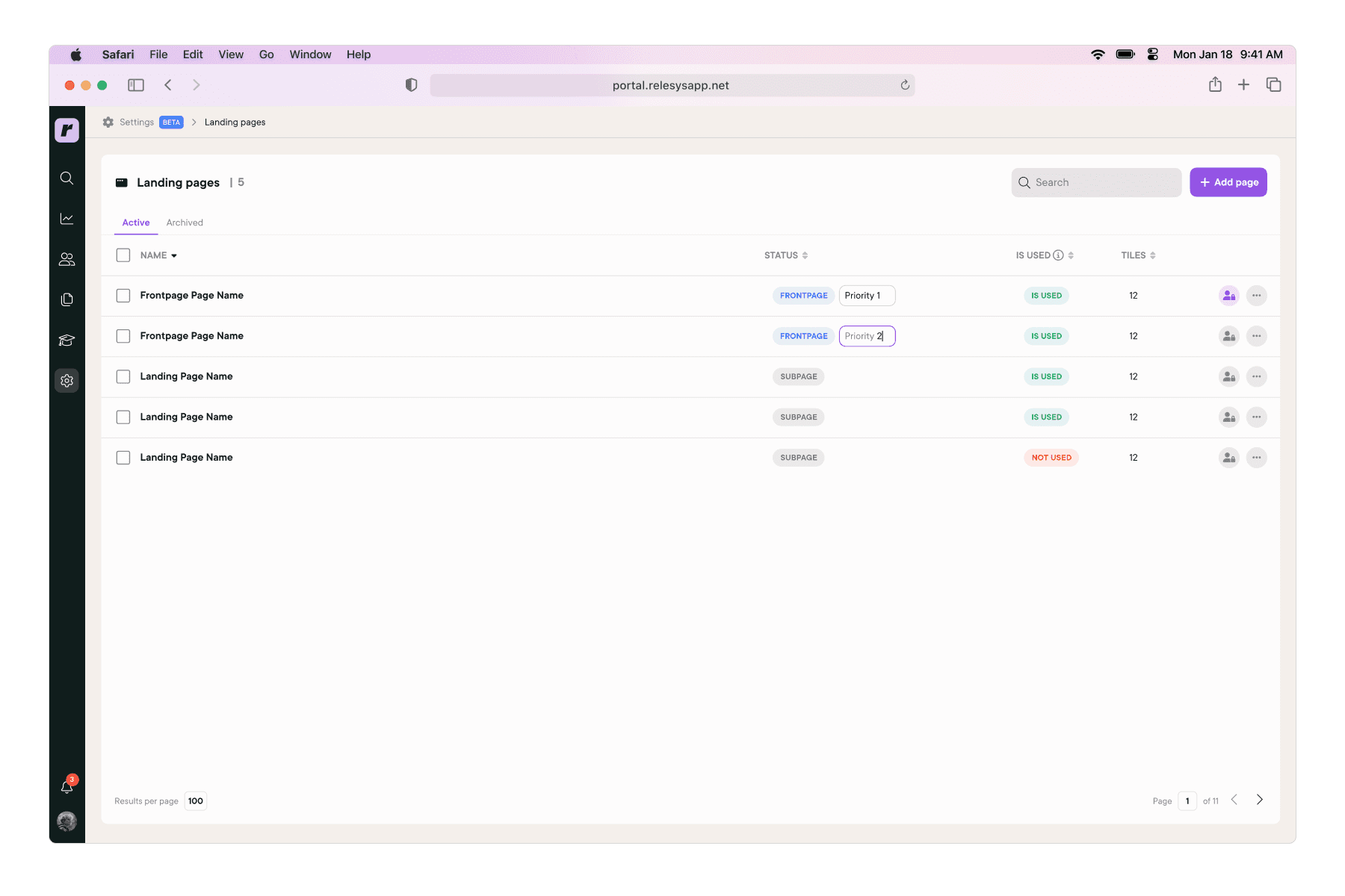
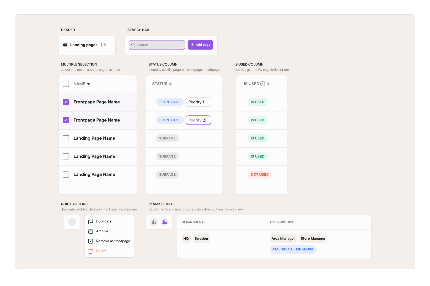
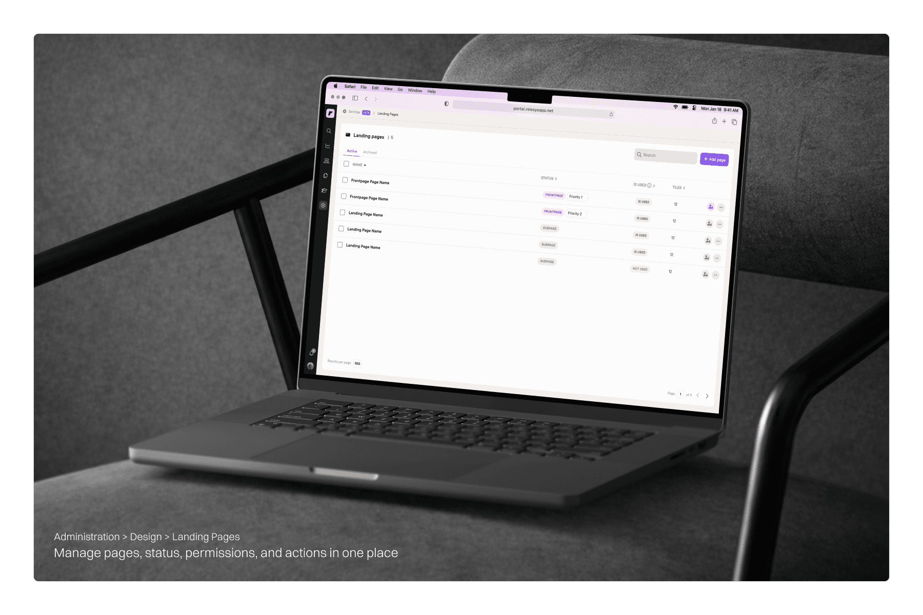
Landing Pages Editor
Managing and structuring pages.
The landing pages editor is where designers manage the structure of each client app, setting up pages, layouts, and deciding what content goes where.
Before
The overview only showed the page name and number of tiles. Key actions like duplicating pages, setting a frontpage, and managing permissions were hidden inside each individual page editor. Getting anything done meant constantly going back and forth, which made managing multiple pages slow and frustrating.
After
We brought everything into one view. Page status, permissions, and priority levels are now visible and editable directly from the overview. Key actions like duplicating, renaming, and deleting pages are right there without needing to open each one. What used to take several steps now takes one.
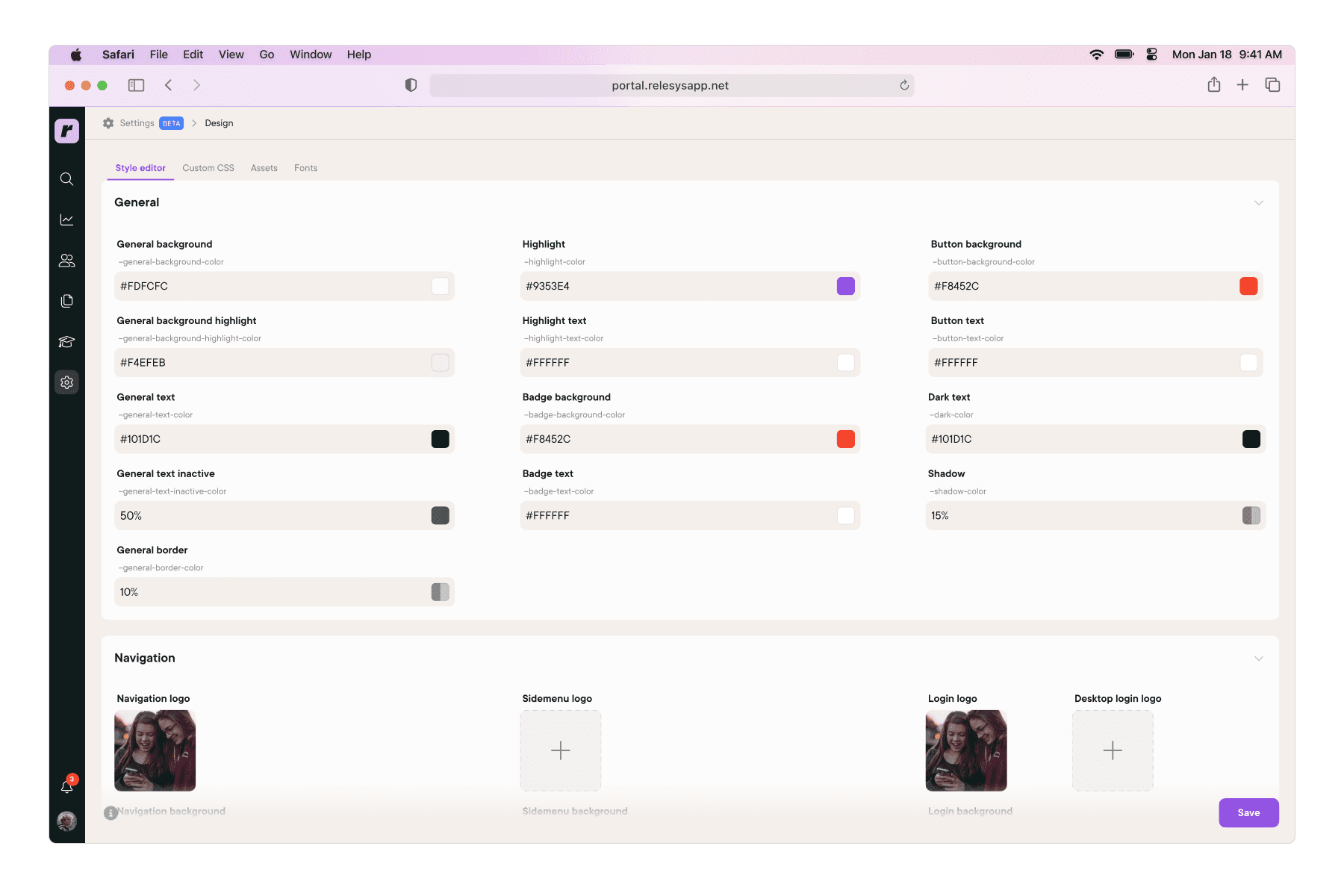
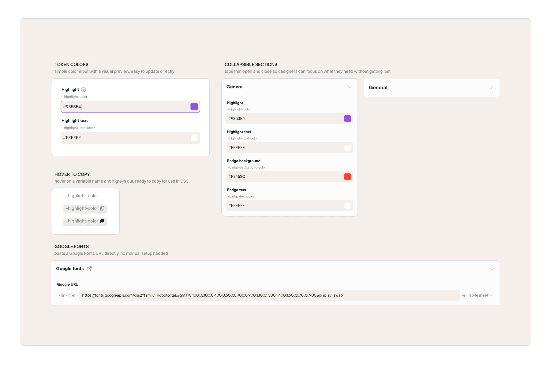
Style Editor
Redesigning the token and styling system.
The style editor is where designers control the visual layer of each client app, colors, typography, and other styling elements that give each brand its look and feel.
Before
The style editor had a token system in place, but it was hard to use. Variable naming was unclear, the structure was confusing, and it was too limited for real work. Most designers ended up skipping it entirely and going straight to CSS, which made configurations harder to understand and maintain over time.
After
We redesigned the style editor to make the token system actually usable. Naming and structure were cleaned up, key styling options were made directly accessible, and support for images that previously required CSS workarounds was added. Google Fonts integration was also introduced, so designers could manage fonts without any manual setup.
The result was less reliance on CSS and a system that was much easier to hand off and onboard new designers into.
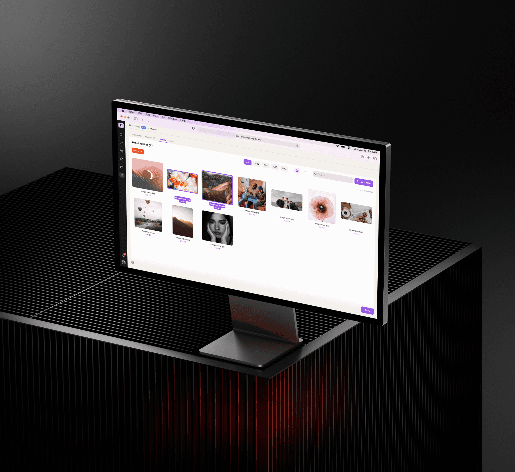
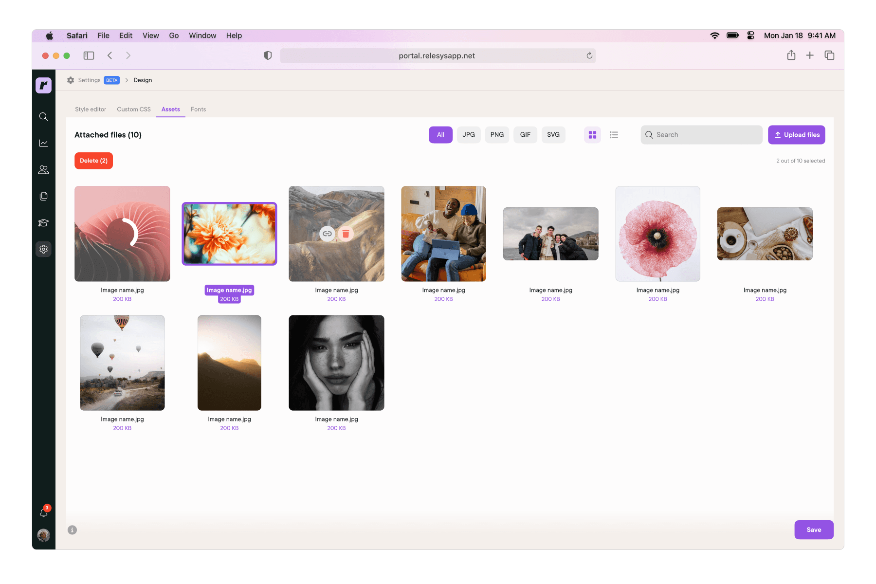
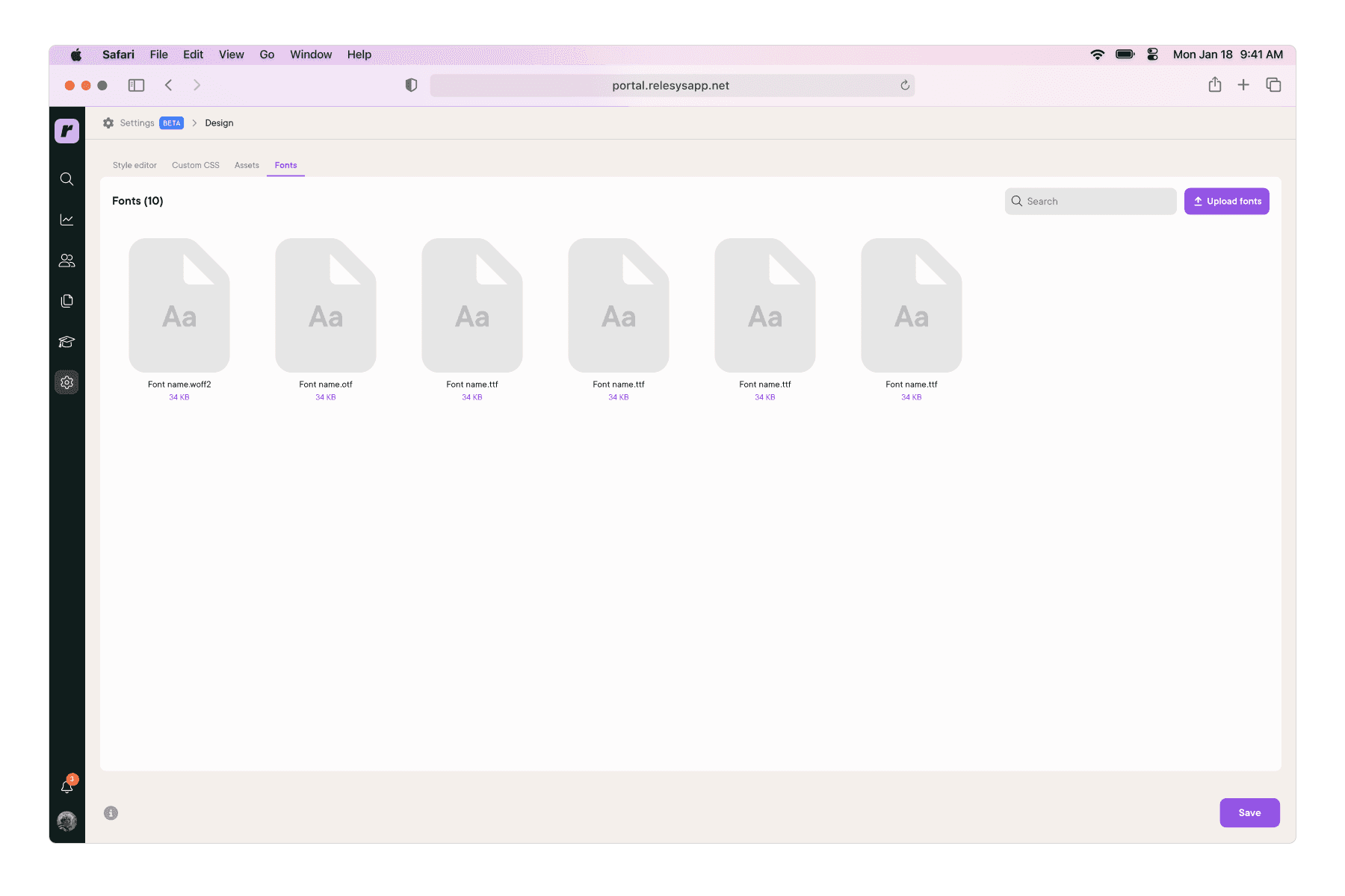
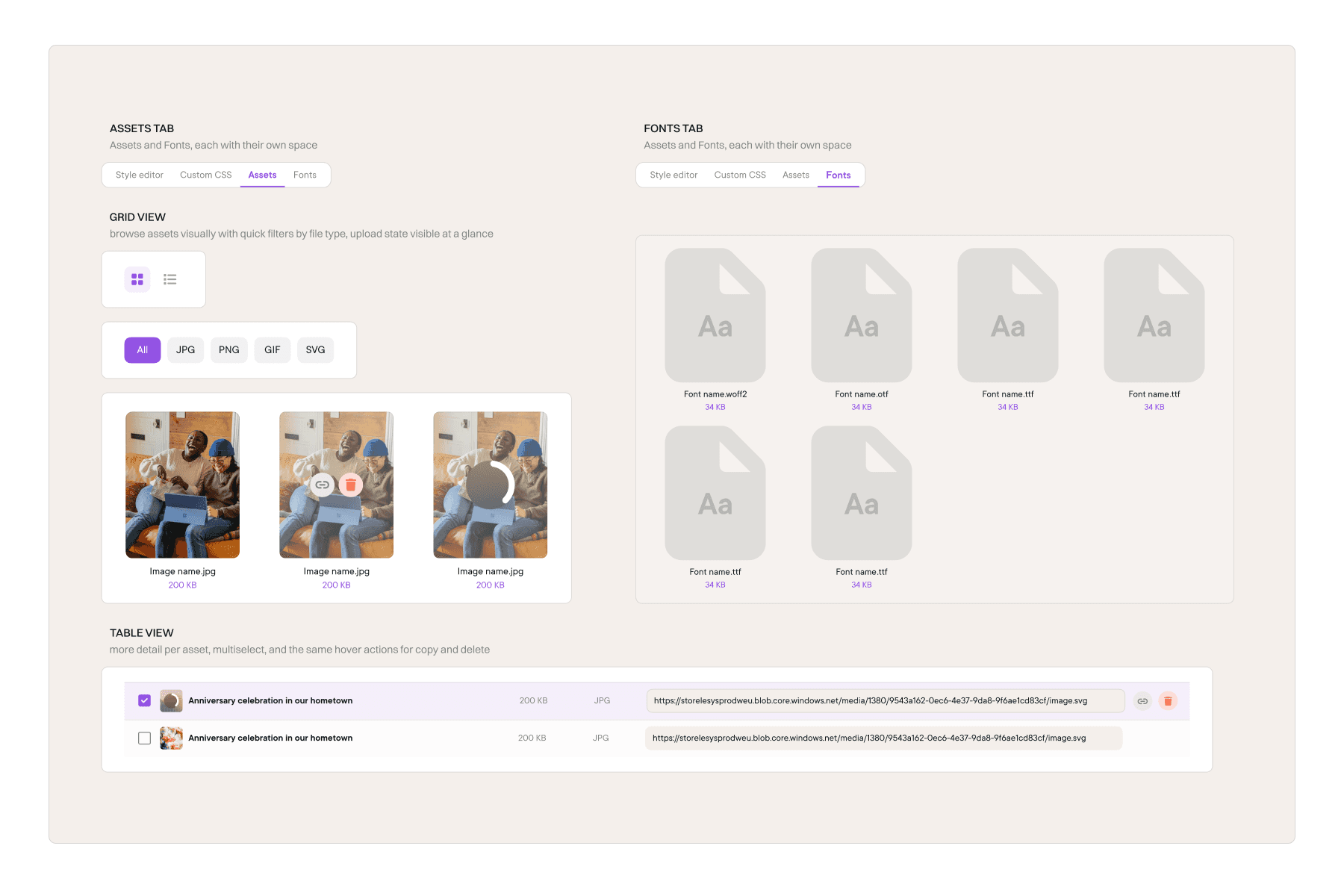
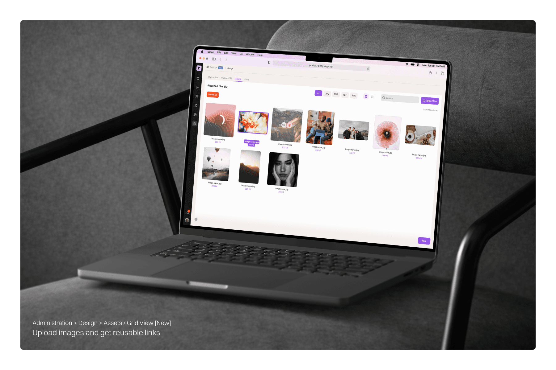
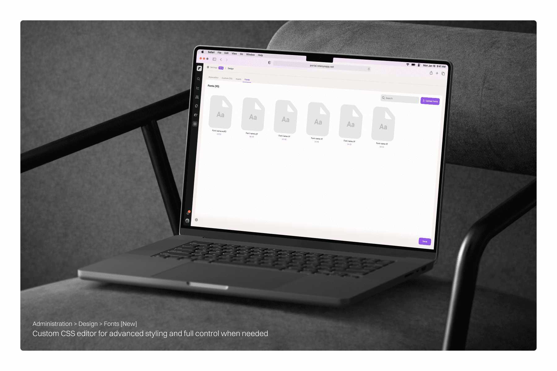
Assets & Fonts
Simplifying how assets and fonts are handled.
Assets and fonts are the building blocks designers use to style each client app, images, icons, and typography that bring each brand to life.
Before
There was no direct way to handle assets inside the portal. Fonts had to be uploaded through an external tool and connected via CSS. Images required a workaround using a custom module just to generate a usable link. It was time-consuming and felt like it shouldn't be that hard.
After
We introduced a dedicated Assets tab where designers can upload images and generate links directly inside the platform. Assets can be browsed in a grid view or accessed quickly through a list view. A Fonts tab was also added, so fonts can be uploaded and managed without any external tools or CSS workarounds. Everything in one place, no workarounds needed.

Impact
Less time on the portal. More time on the work.
The improvements made everyday work noticeably smoother. The landing pages editor became much easier to work with, especially during those chaotic moments when multiple pages needed to go live for different user groups at the same time. The style editor got cleaner and clearer, easier for designers who had been using it for years and much more approachable for anyone new to it. And the assets section ended up becoming more than just a fix, it turned into a dedicated space for each client, somewhere to store, manage, and reuse assets over time. Less of a workaround, more of a hub.


Reflection
Small changes, real impact
Looking back, what stood out most was how much a few focused improvements could change the daily experience for the team. You don't always need to redesign everything, sometimes removing one unnecessary step is enough to make a tool feel completely different.
Not everything we proposed made it into the final product. Parts of the experience stayed tied to the existing structure, and some improvements were deprioritized along the way. That's just the reality of product work. But the process of identifying the right problems, talking to the people affected, and shaping better workflows that part stays with you regardless of what ships.
”The difference between a good tool and a great one is how little effort it takes to use it.”
Older
Newer